PRODUCT Branding

Concept
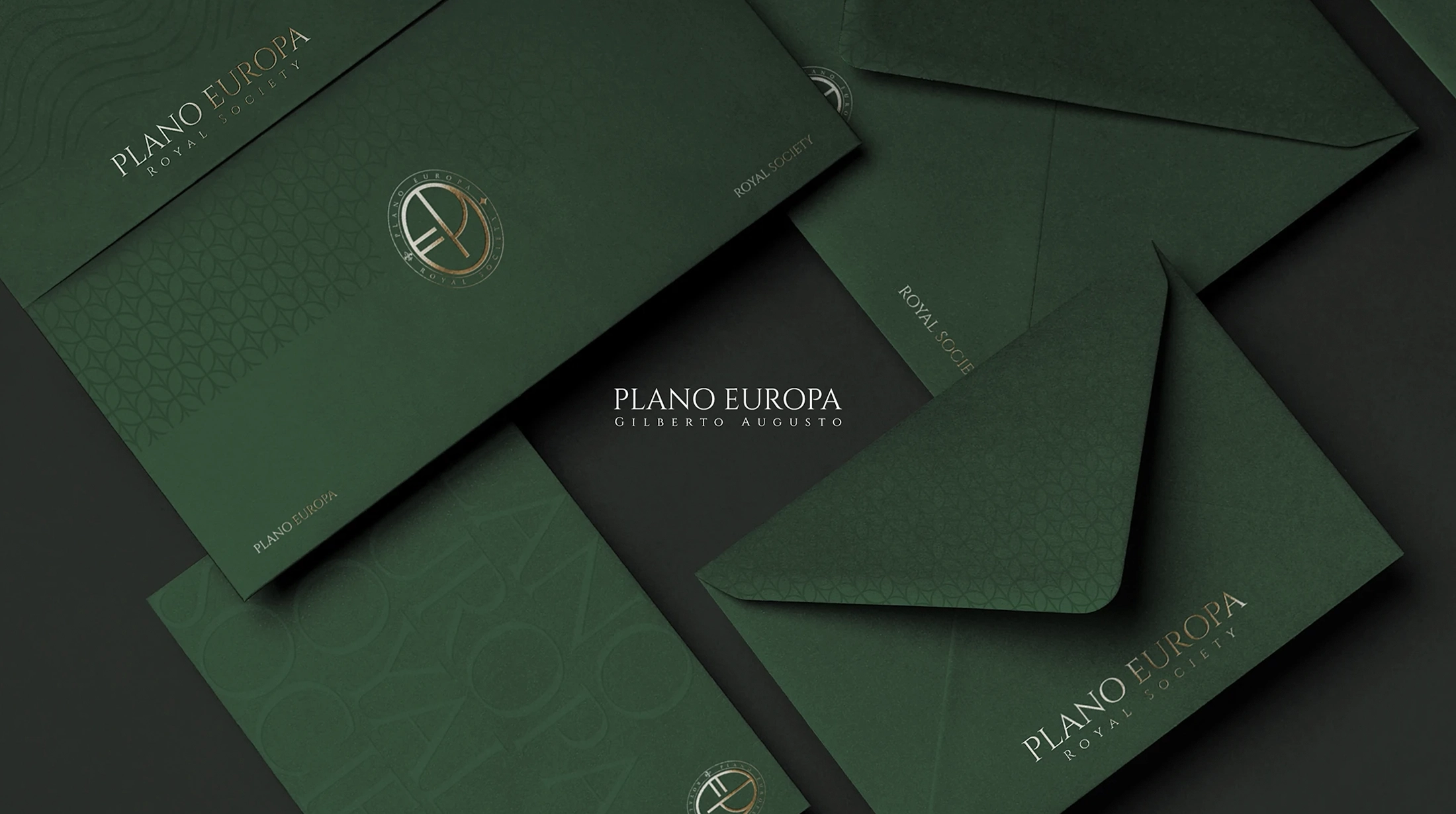
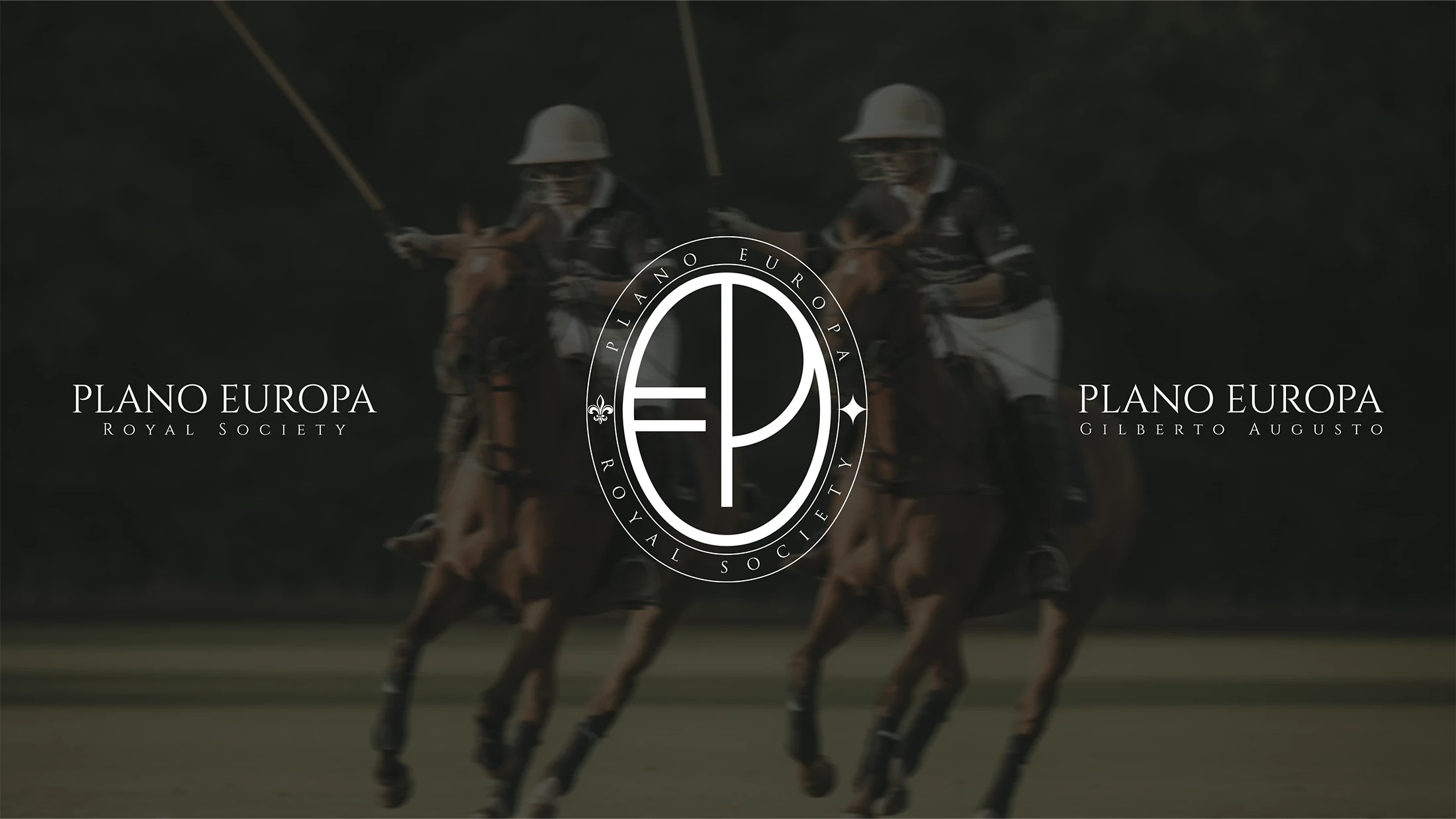
Inspired by the world of European nobility and the classical traditions of excellence, the symbol of Plano Europa – Royal Society represents more than aesthetic sophistication: it communicates silent power, intellectual hierarchy, and exclusivity.
The visual construction draws from the equestrian universe of polo — a sport reserved for the strategic elite — bringing to the brand the symbolism of precision, mastery, and discipline in motion.


Concept
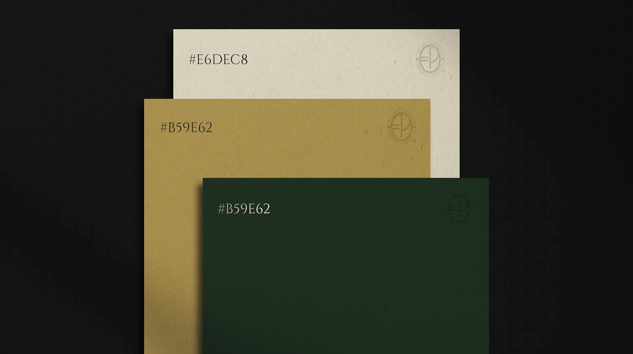
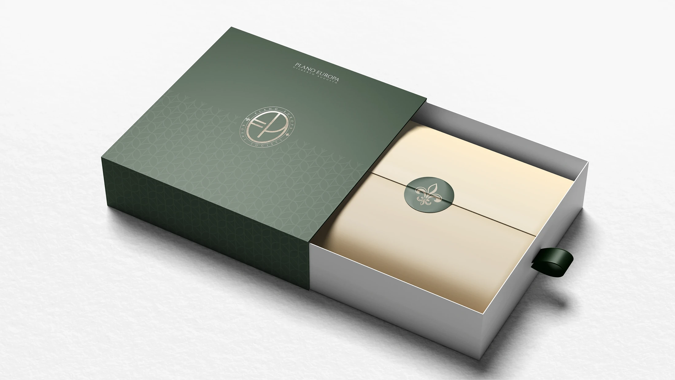
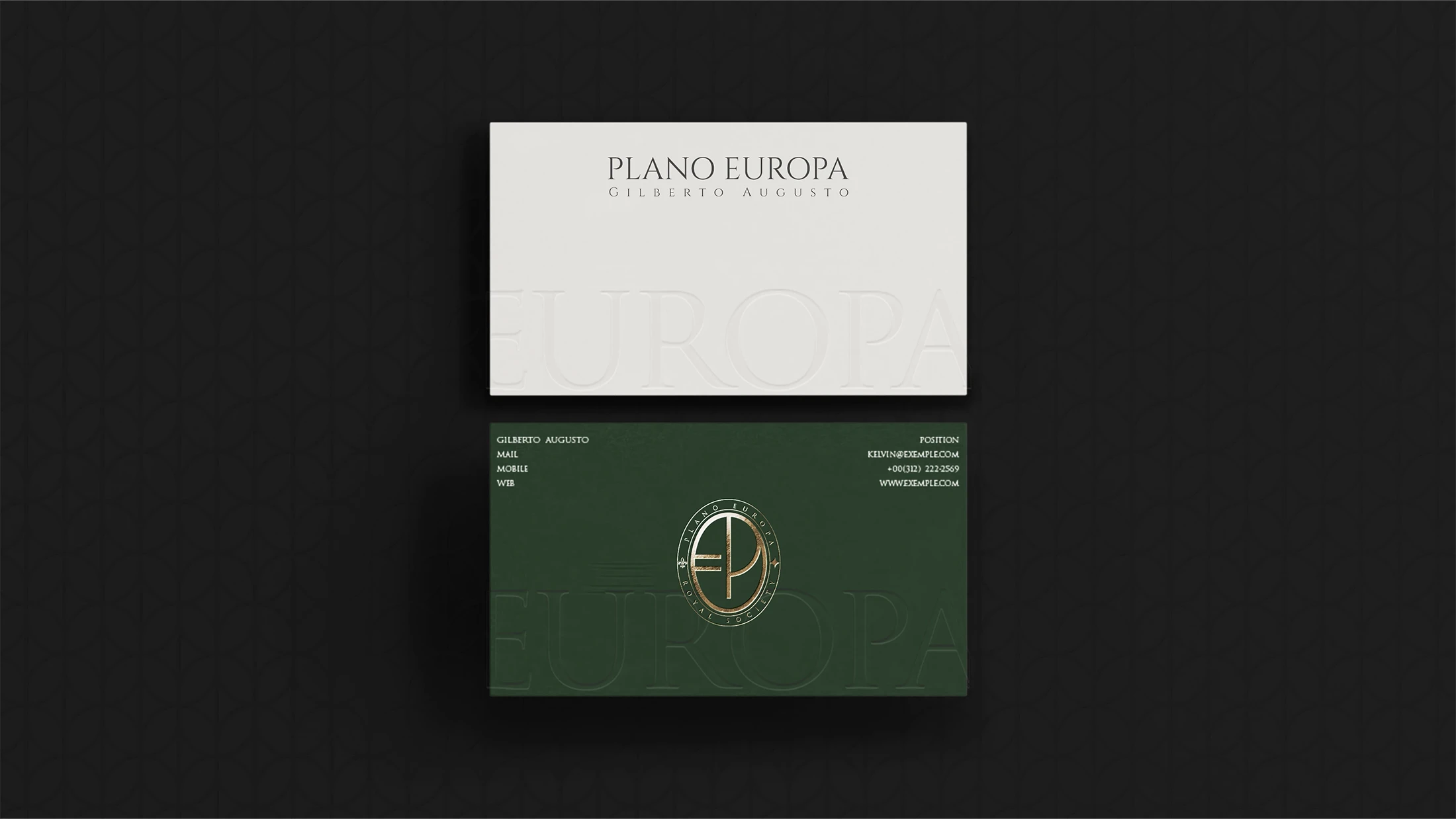
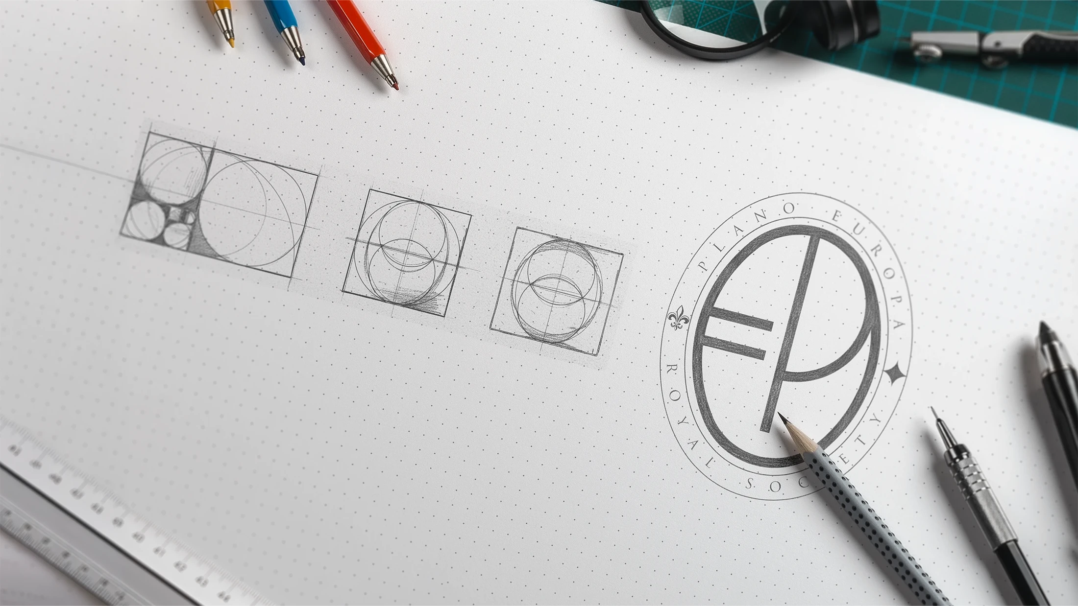
The sculpted typography and the central monogram unite the initials “P” and “E” into an almost heraldic form, defined by balance, golden-ratio proportion, and a textured gold finish that reinforces the idea of exclusivity and tradition.
The oval frame evokes royal seals and restricted societies, signaling belonging to a circle where intellectual capital and long-term vision rise above the noise of the common market.
Strength
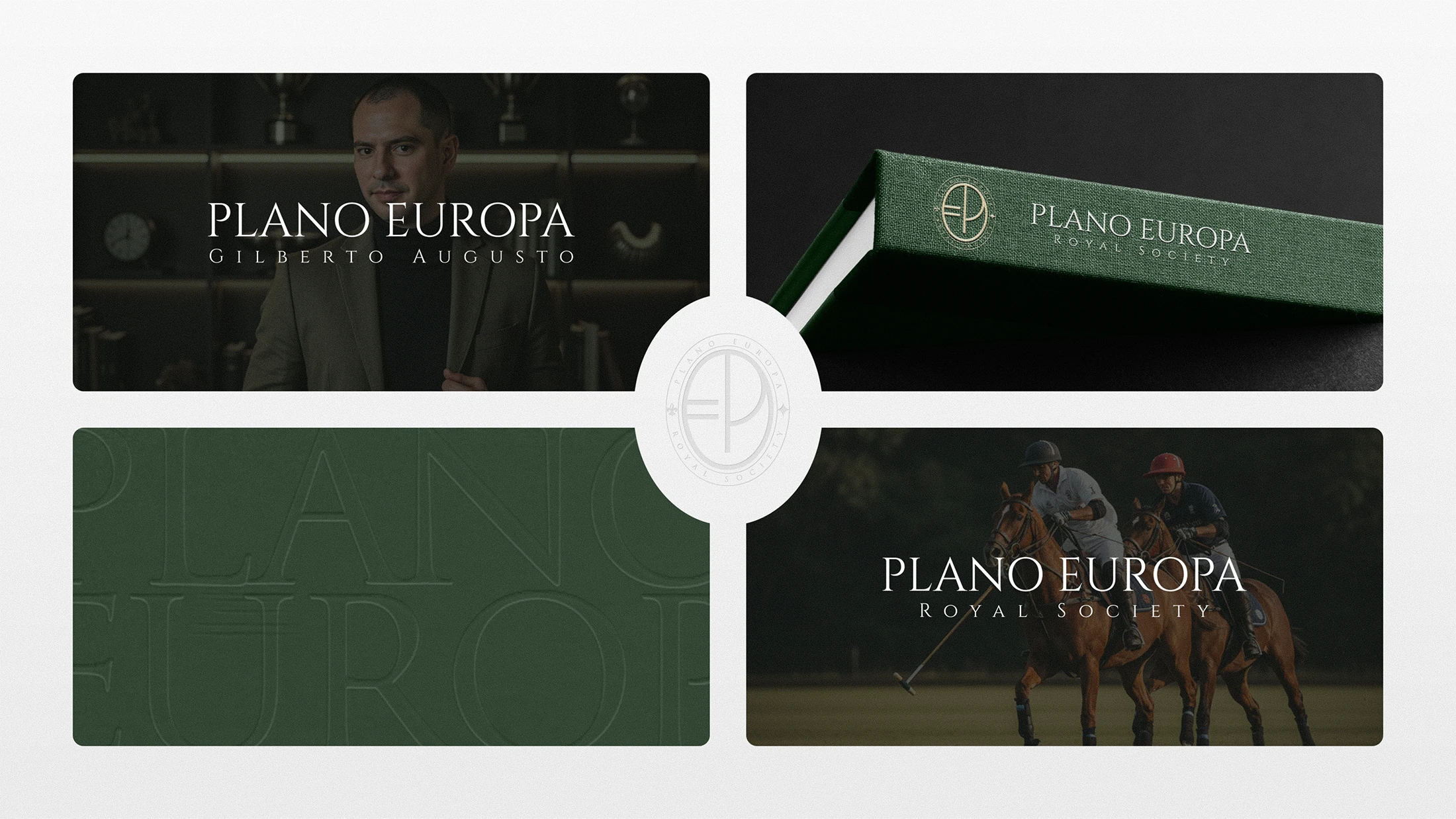
When a brand is crafted with intention, every line carries more than beauty — it carries meaning, position, and legacy.
STRONG BRANDS do not fade — they endure through time, echo in memory, and imprint themselves in the history of those who belong.